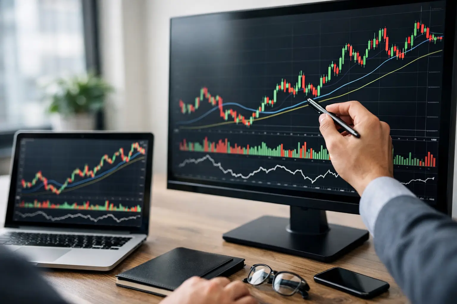
A graph does not predict the future. In trading, it especially shows where the market hesitates, accelerates or runs out of steam. This is precisely the objective of this trading chart reading guide: to learn to read what the price says, without transforming each candle into a promise of gain.
For a beginner investor, the difficulty does not come from the number of indicators available. It comes more from the noise. Between candlesticks, moving averages, volumes, patterns and contradictory signals, we can quickly confuse analysis and information overload. A good graphic reading first serves to clarify. It helps to establish context, identify important areas and better decide when to enter, wait or do nothing.
Guide to reading chart trading: start with the price
The first rule is simple: price comes before indicators. A chart is a visual representation of the clash between buyers and sellers. As long as this idea is not clear, technical tools remain decorative.
The most used format is the Japanese candlestick. Each candle represents a specific period of time – a minute, an hour, a day or more. It contains four pieces of information: the opening price, the high, the low and the closing price. When the close is above the open, the candle is generally bullish. Otherwise, it is bearish.
What matters is not just the color of the candle, but its structure. A long body often reflects a clear impulse. A significant high wick may indicate a rejection of high prices. A marked low wick can show that buyers have defended an area. A small candle after a strong impulse often signals a phase of hesitation. This is not a sufficient signal on its own, but it is useful information.
Reading a graph therefore means observing the succession of these behaviors. Is the market rising with conviction or is it progressing with difficulty? Are dips quickly redeemed? Are recent highs surpassed or rejected? These questions are more useful than an isolated indicator.
Understand the trend before looking for an entry point
Many beginners first look for where to buy or sell. In reality, you must first identify the general meaning of the market. An uptrend is often recognized by a series of ascending peaks and troughs. A downtrend shows the opposite. In between, there are range phases, where the price moves sideways in a corridor.
This distinction changes everything. In an uptrend, a pullback toward support can make sense. In a downtrend, the same pullback may just be a pause before a new downward leg. In a range, breakouts are often less reliable and false signals more frequent.
The classic trap consists of analyzing a graph without taking into account the unit of time. An asset can be bullish daily, neutral in four hours and bearish in fifteen minutes. None of these findings are false. They simply describe different backgrounds. To avoid confusion, you must choose simple logic: one unit of time for the context, another for execution. For example, spot the trend on a daily basis then refine the entry within an hour.
Supports and resistances: zones, not magic lines
Support is an area where the decline has already been curbed. Resistance is an area where the rise has already stalled. These levels exist because market participants react to them, not because a line drawn on the screen has any particular power.
This is why it is better to talk about zones than exact levels. The price often rises slightly above a support or resistance before moving back up. This phenomenon is common, especially in volatile markets like cryptos. Those who expect absolute precision often get out too early or enter too late.
An area becomes more interesting when it has been tested several times, when it coincides with a former high or low, or when it is visible over several time units. But here again, we must remain measured. The more obvious a level is, the more attention it attracts, and the more violent the cash-hunting movements can be around that area.
Volume: useful, but rarely sufficient alone
The volume allows us to estimate the intensity of participation. A rise accompanied by high volume can signal real market interest. Conversely, slow progression with little volume can reflect fragile movement.
That said, volume is not an absolute judge. On certain assets, depending on the platform or market observed, it may be incomplete or difficult to interpret. In crypto, for example, the dispersion of exchanges can confuse the reading. We must therefore use volume as an element of confirmation, not as an independent truth.
A good reflex is to compare. Is a breakout of resistance supported by volume above the recent average? Is a rebound on support accompanied by a clear recovery in trade? If the answer is no, caution is often best.
Graphical figures: useful if you keep context
The figures are very attractive to beginners because they give the impression of clear language. Triangle, double vertex, shoulder-head-shoulder, flag, wedge: these patterns can be relevant, but only if the context supports them.
A double top does not have the same meaning after a strong uptrend or in the middle of a confusing range. A triangle does not automatically announce a clean breakout. A figure works best when it is part of a readable structure, close to an important area, with coherent dynamics and, sometimes, a confirming volume.
In other words, the figures should not replace reading the price. They have to help him. If you start seeing shapes everywhere, it’s often a sign that you’re straining interpretation.
Trading chart reading guide: indicators to really keep
A beginner does not need ten indicators. Two or three well-understood tools are better than a saturated screen. Moving averages can help visualize the trend. The RSI can give an idea of momentum and signal excesses. Bollinger bands can illuminate phases of volatility compression or expansion.
The key point is to understand what the indicator measures. A moving average lags price, by construction. The RSI can stay in the overbought zone for a long time in a strong uptrend. A breakout of the Bollinger Bands is not automatically a reversal. Every tool has its blind spots.
If you use an indicator, ask yourself a simple question: what does it add that the price doesn’t already show? If it only vaguely confirms what you see, it may be useless. A clean reading is often more efficient than a sophisticated but contradictory reading.
The most common mistakes among individuals
The first mistake is changing methods every three days. The second is to seek certainty in a probabilistic environment. The third is to analyze after the fact with excessive confidence, when in real time the situation was ambiguous.
Another common mistake is confusing signal and scenario. A signal is a concrete element – a breakout, a rejection, a recovery of support. A scenario is a market hypothesis. We must accept that an attractive scenario can be quickly invalidated.
There is also the emotional bias. After two losses, we see reversals everywhere. After two wins, we overestimate our reading. This is why a written framework remains useful: which areas I monitor, over what time unit, with what level of invalidation, and for what objective. Without this framework, graphic reading often becomes an a posteriori justification.
A simple method to progress without getting distracted
Always start with the higher unit of time to set the context. Then identify major areas of support and resistance. Observe the price structure: trend, range, acceleration or running out of steam. Finally add a single confirmation tool, such as volume or a moving average.
Then return to a shorter unit of time to look for consistent execution. If the context is bullish but the entry is confusing, wait. Doing nothing is also a decision. This is often a good decision.
To progress quickly, replaying graphics is very effective. Take screenshots, note what you saw before the movement, then compare with the result. This practice develops a skill more valuable than flair: the ability to distinguish a clean context from a messy context.
AI-assisted analysis tools can also save time, provided they are used as decision-making aids and not as a substitute for judgment. A platform like Yapuka Trader can help filter information, structure analysis and spot trends, but the quality of a decision still depends on the framework chosen and the discipline applied.
Graphical reading is not a promise of perfect accuracy. It is a method to reduce uncertainty, prioritize signals and avoid impulsive decisions. The more you seek to understand the logic of the market rather than guessing the next candle, the stronger your progress will be. And this is often where real investor autonomy begins.